| 
|
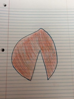
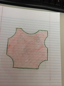
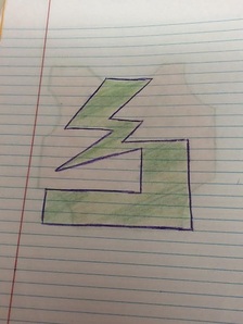
1. I mostly used balance and contrast to help my designs look interesting. I used balance for my top left piece and my bottom piece by making them somewhat the same shape throughout each separate piece. . I used contrast on my top right piece by using green as an overall color and purple as an outline to give it some "spark."
2. By being able to use the media, knowing what techniques, elements, and principles to use, I am able to learn how to add meaning and emotion to each piece I make. Whether it be using dark colors and jagged textures to make it look like a sad or angry piece, or using bright and warm colors and curvy textures to make it look colorful and happy.
3. At first, I randomly threw some stuff on the paper and hoped that would work, but then I realized that I should take each "random" piece and make them each something of their own. I thought I should try to make each one stand out from the others.
 RSS Feed
